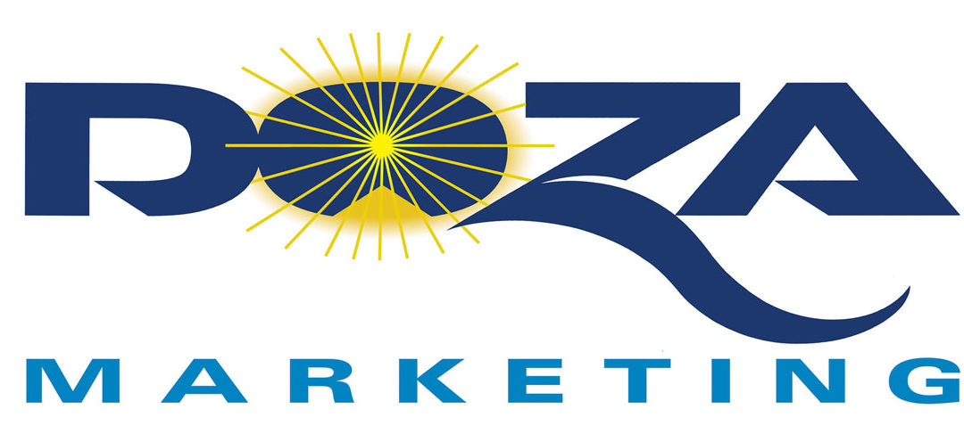
In today’s ocean of business logo designs, many are mediocre. Why settle for mediocre at best? A great logo is built with hand lettering skills that make familiar letterforms exclusive to you. The best designs have a striking symbol that communicates what the business or product is all about. Ted DeCagna has completed 199 career logos, to date. He is an expert at choosing or creating a unique font that is appropriate for the assignment… the font must have the right feel for the client or product and great legibility.
Ted then energizes the topography by turning the average into something special with his hand lettering skills. Take a recent assignment for a new internet marketing firm. Doza Marketing. (see above logo). Ted became excited as soon as saw the simple easy to read the name, and since there were some letters that have a lot of personality. The letter Z is one of Ted’s favorite letters of the alphabet with its strong diagonal strokes. Ted knew he could give it a lot of pizazz! In this case, adding a dynamic, yet simple, brush-like swish stroke, to the Z with an inside cut curve really made a standard Z come to life! Ted hand rendered 8-10 preliminary custom Z sketches, before deciding on the best stroke. Ted also modified the font of the Z to give it a more extended, streamlined look. Ted also added special diagonal cuts on the D and a customized A to give the logo a contemporary look with style.
In addition, Ted also had the challenge of helping the young, energic owner convey his request to say “bright ideas”. In this case, the best way to convey bright ideas was to create a dynamic radial liner sun burst with a center yellow gradating color to gold. This gold sun solar eclipse effect added to the excitement of the design. Ted used a photo of a solar eclipse as reference to create this exciting radial gradient effect. The “O” in Doza provided the perfect circular letter to contain this dynamic sun burst. There was no need for a separate shape to contain the sun burst.
The thin liner strokes worked very well so as not to hurt legibility when incorporating a design with letterforms which was something Ted is always conscience of. If letterforms become too bastardized, it is easy to make the letters hard to read, which is a critical mistake of some logos. It is important to adhere to the “less is more” design rule, which many top designers use, and keep the lettering clean and simple, so it is very legible for all purposes; large on a trade show sign or vehicle and, of course, small on a web site or business card. This is especially important since about 65% of internet searches for a web site are done on small mobile devices, Ipads, tablets and smart phones in 2018.
The final design created was a striking, contemporary logo that established a new powerful identity for this original, up and coming business and will serve them well for the next 25 years or more.
A final reward was the client expressing extreme satisfaction and pride.


Recent Comments