Success Story # 1
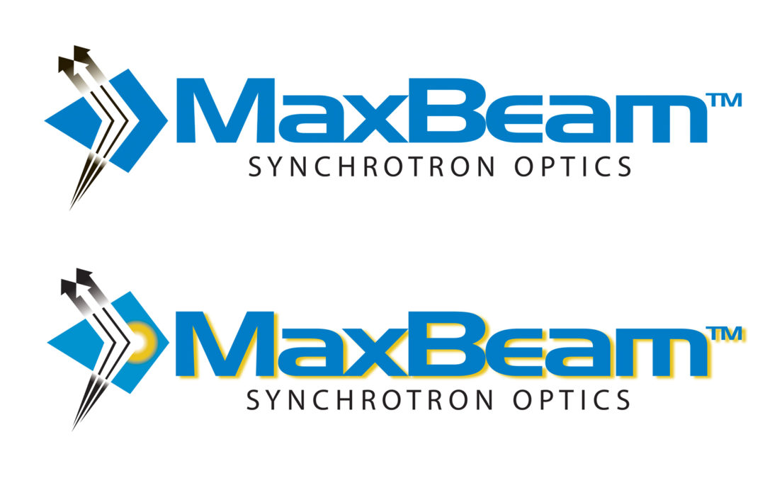
Having designed over 185 logos in my career, I’ve had some very difficult design challenges. A recent one came from a company who specializes in industrial and laboratory based X-ray technology in Michigan. The tasked logo design had to communicate x-ray detraction to leading physicists from Michigan and their clients all over the world. During the brainstorming process, I studied scientific charts, graphs and diaphragms that illustrated the incidence of an x-ray beam coming into contact with a surface. My design had to include liner lines with arrows to show direction and also somehow convey exposure of an x-ray and of course look dynamic and contemporary. The best logo designs simplify a concept into a simplistic symbol that still communicates, so the complexity of x-ray diffraction made the task of illustrating a complex scientific event much harder than usual. Further compounding the challenge was the fact that my client consisted of a team of 10 physicists and engineers who all had to agree on which graphic depiction would best communicate x-ray diffraction. I explored numerous dynamic arrows and motion effects with different shapes to capture this event. Upon my initial presentation of 12 various design concepts that I had produced, my client did not select a winner after the first presentation, but fortunately they did like a few design elements that they wanted to see refinements of. Determined to please this big client and reach an effective solution, I went back to the drawing board with the constructive feedback I had received. I never give up if the first time up at bat is a strike out. It took the exploration of many extra design renderings, but finally my 22nd design received the unanimous winning vote from the team of scientists. An alternate final logo design included a radial gradient to indicate the exact moment of the incident x-ray (shown below the winning selection above) but the client decided to further simplify the logo and eliminate the radial gradient feature. The final design was selected and approved to the delight of my client and 5 months later proved to be an award winner in the national design annual, American Graphic Design and Advertising 31, which will be published in 2018.
To young designers out there, the lesson to learn from this difficult assignment is to be very patient especially with a committee of clients, and expect the logo approval to take time. This type of assignment is to graphically illustrate a complex scientific event; You can’t expect to hit the home run the first time up at bat. It’s essential to work the solution very hard and explore many design ideas with endless drawings. “Rome was not built in a day” and the best designs from history usually took countless hours to achieve. The reward will not only be the wonderful satisfaction of client approval, but also the personal gratification that you did not give up and solved a most difficult challenge. Finally, there is no greater professional recognition than winning a best logo design award decided from veteran designers in your industry for all the extra hours needed sometimes to succeed with a difficult design challenge.


Recent Comments