Before & After Logo Design in NJ

Award-Winning Logo and Branding Designs Create Unique Corporate Identity
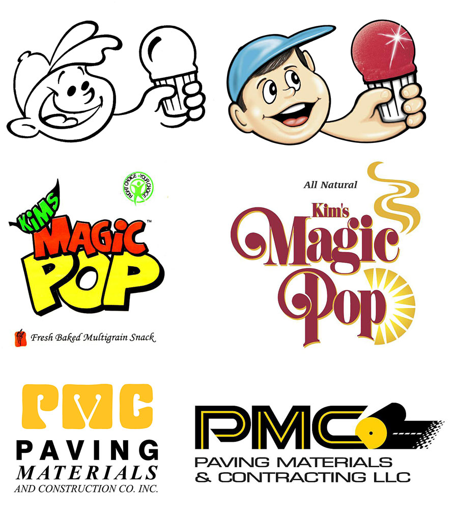
(2) Kim’s Magic Pop, Palisades Park and Moonachie, New Jersey, wholesome fresh made rice and wheat cakes. On the left was the clients original logo which was getting poor sales and had too cartoony a look too it. Ted designed a very unique logo with a font that has a classy feel and custom curls to the letters that give the letterforms a nice unique flair.
(3) Paving Materials and Contracting, Montville, New Jersey was using this logo on the left which included a plumb bob tool incorporated with the M. Ted convinced the client that the logo had a very dated look to it and no one would see plumb bob tool in the M. Therefore, Ted designed a symbol that communicates paving with the impression of a single roller and dynamic printers dots to convey the gradation application of paving material on a road with a centerline. Ted then incorporated this symbol with dynamic hand lettered typography with a contemporary extended font and a bright yellow gold center. The client now gets many compliments about the new extra bold contemporary look of the new logo used on the new web site, stationery and all their paving equipment.
Ted also services clients of Westfield, Clark, Morristown and Piscataway New Jersey.
Call or Email Ted DeCagna
Ted will speak to you directly and prvide a quote promptly.
908.272.6777 ted@tdgraphicdesign.net
6 Edward Place, Cranford, NJ 07016
