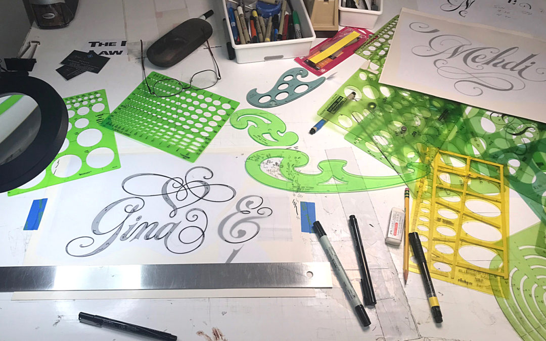
Some people confuse calligraphy and hand lettering. While calligraphy is the free hand Lettering using a chisel point pen, often used for elegant invitations and certificates, Hand Lettering is the individual hand rendering of letterforms to create custom, totally unique typography. The standard procedure to render a hand lettered logo is to first create several tight rough sketches in black and white. Once your client selects and approves one of your rough logotype sketches you then want to tape your rough to heavy card stock or board and lay vellum or drafting mylar over the rough design. I use a steel T square to make sure the lettering is straight. I then use an adjustable triangle at the perfect diagonal setting to make sure all my letter strokes are the exact same angle. Now for the big tip, there’s nothing wrong with using a T square to draw a perfectly straight line is there? So, my tip is to purchase several plastic architectural drawings plastic templates to render your unusual curves in letters. While I sometimes render some strokes freehand, and I can do the whole design in free hand, I’m much faster using these great plastic templates to first render my ultra-fine outlines using any number of ultra fine artist pens. I prefer Pigma Micron, Prismacolor and Faber Castell, but there are so many good brands out there and they are much easier than technical pens which do clog very easily and the ink smears much easier. With these pens the ink dries much faster and that minimizes accidental smearing.
I own about 16 templates (see photo above) at many different angle degrees. Oval, Eclipse and circles templates and French Curves and an adjustable curve. Since the vellum is transparent I search and match up the ideal size oval or ellipse or circle to the curves of my lettering and draw line segments. I say segments as you will never find the perfect size template oval to do a complete letter or flourish, so you must render the letters in segments. Don’t worry if some lines are not perfectly meeting, you can always adjust and smooth out connecting lines with a second stroke slightly larger and if you make a mistake, you can always retouch an imperfection later with Pro White retouching paint and an ultra-fine sable point brush. First get all the outlines of the letterforms perfect, then fill in with heavy black marker or permanent shaper to fill solid. I like a permanent Sharpie as its dry’s fast and does not smear easily. Try to work on different parts of the logo to allow time for the ink to dry (usually a minute or two) and avoid smudging the ink with the templates. I even use a fan sometimes to help speed up ink drying and avoid smudging. If you accidentally smudge a line badly, another good tip if to take a cosmetic /ear Q-Tip and dip it in bleach and slowly roll the Q-tip over the bad ink smudge and erase the mistake! You’re working on plastic so you can easily erase a small ink line. Dry the area well before redrawing your next outline.
Rotating many templates and French curves can be tedious but also a fun game of finding the right curves and perfect size ovals, circle or ellipses openings. Finally, if you need to fix an imperfection after the opaque pro white retouching you can use Photoshop to get your final perfect. Make sure you scan your lettering large at 1200 dpi, enlarge your logo very big on your screen then use the white brush or erase tool to quick erase the lettering imperfection, then draw the curve needed with the pen tool and fill in with black. I find dropping the dpi to 700 dpi is more than enough to allow razor sharp print out at about 10 inches without problems as 1200 dpi can be a huge file and really slow down or crash printing. Finally, I usually color the lettering in Photoshop an / or Illustrator and create 8-12 color studies to find the ideal color combination and give you client many color choices. I use an Epson Sure Color 800 printer with Rosetta Color Software which creates very accurate Pantone ink color matches. Very Important to have a postscript color printer to simulate accurate color inks and not show the client only RGB colors which of course are only computer monitor colors.
A Final tip, be patient and practice, practice, practice! Hand Lettering is a very labor-intensive process to create custom logotypes that your client has never seen before. It takes a ton of practice to get very good at this but once you do master Hand lettering you will certainly be able deliver the ultimate creative logotype designs to your client, and likely result in many design awards.
I welcome any comments or questions about this educational blog to Ted@tdgraphicdesign.net


Recent Comments