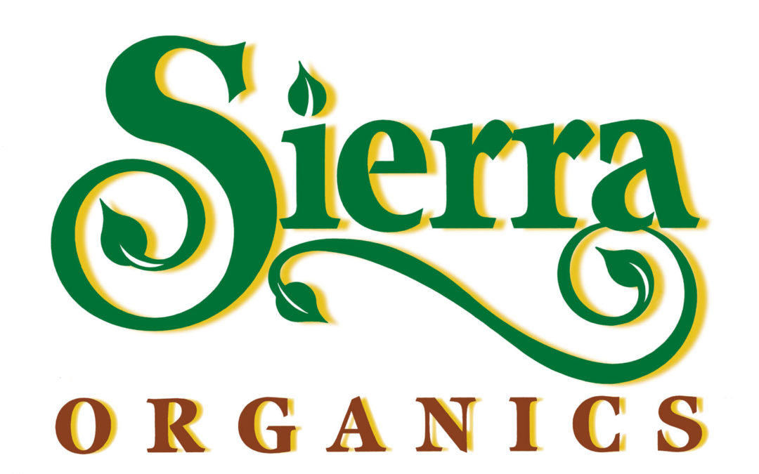
Ted DeCagna was recently commissioned to create a creative logo for an essential oil’s product line called Sierra Organics. The first product is a wonderful holistic product called Oil of Oregano which has many very beneficial healing benefits. Since many of the products in this product line are all natural and derived from plants Ted created a logotype with very creative typography using very unique core font and designed a very special “S” which Ted believes is the most beautiful letter in the alphabet.
”I wanted to create something special and I was delighted to hear the product name was Sierra Organics as that gave me the opportunity to design a very creative, stylish “S” and give it a wonderful curl. “While my preliminary hand lettering designs were good I thought I could really make the logotype special given the fact that all product are derived from plants to end several
elements of the logo with leaves instead of a curled point.” Ted added a very stylish bold flourish under the typography to enhance the logo and end the flourish with leaves. Adding a leaf to the end center point of the S gives the logotype a very nice quality. Replacing the dot on the letter “I” with a leaf pointed upward added another very classy touch. Since the labels for this product are for very tiny bottles Ted had to make sure the logo was very bold and would have excellent legibility at one inch wide, so, he was careful to not add any flourishes to the logo width as that would force the point size to be even smaller when reduced making the logo hard to read at the one-inch size. Ted kept the logo simple and clean yet very creative and playful resulting in a logotype that the client is very happy with and is confident will serve the product line very well for many years to come.


Recent Comments