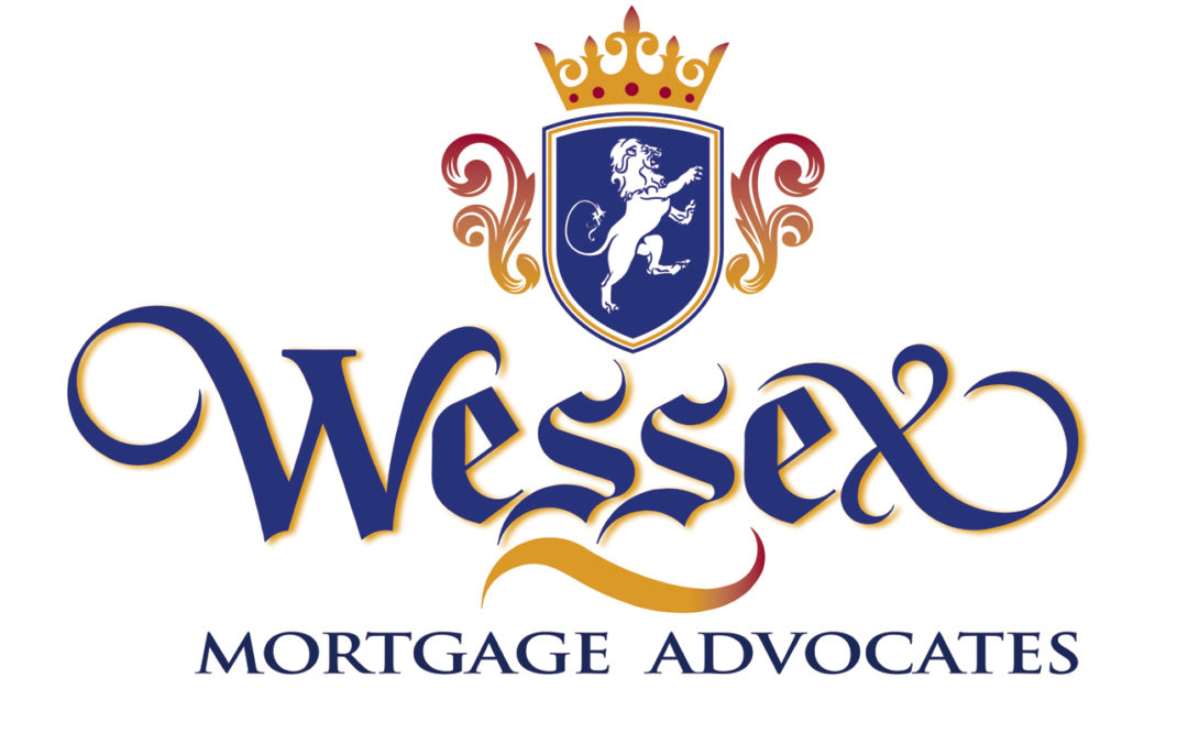
Ted DeCagna recently received a great assignment to create a new logotype using a classic old English font for a first-rate mortgage services company called Wessex Mortgage Advocates. The client had new logo designed with standard old English font and was not happy with the look. Ted looked at this assignment as a terrific opportunity to use his hand lettering skills to create something very unique and special. While there are dozens of old English fonts, standard old English lettering is often very hard to read and contains extra lines and details that make these 500-year-old letter-forms very hard to read. Ted’s first priority with any logo assignment is to create a design that’s unique but very legible. Many young designers get very caught up in making letter forms creative and different but they can be extremely hard to read “Ted feels If you can’t read a logotype, what good is it?” , “You’re doing the client a disservice if it’s hard to read”.
So, Ted devoted many hours into creating a logo type with a custom old English letter-form without all the extra line work you usually see in newspaper Headline old English fonts and created this special logotype for Wessex Mortgage that is very legible and expresses class and style without the extra line work these antique fonts usually have. To achieve maximum legibility Ted customized the W with a classic roman W but gave it flourishes to make the look consistent with the old English letter-forms and balance out the fancy X which is very special.
The client wanted a classic looking shield and lion as his symbol so Ted created a great shield with a strong lion, a gold crown with red ruby’s and added two flourishes left and right to frame the shield. To add a more three-dimensional look to the logo Ted created a color gradient from burgundy to gold in the crown and flourishes as well as adding a slight gold drop shadow to the letter forms to give the logo more color and dimension. After exploring a dozen color combinations this deep blue, gold and burgundy is the perfect color combination to project a rich and classic “royal looking feel” the client was hoping for. The client is delighted with Teds final results.
So, Ted’s advice to young designers trying to create a unique logo is “think outside the box”, do not marry standard fonts but create your own that have a cleaner, more contemporary look while maintaining a classic look and style.
Ted DeCagna has designed 222 logo designs in his career and has earned 29 design awards for his very unique hand lettered logos to date, January 2023.


Recent Comments