
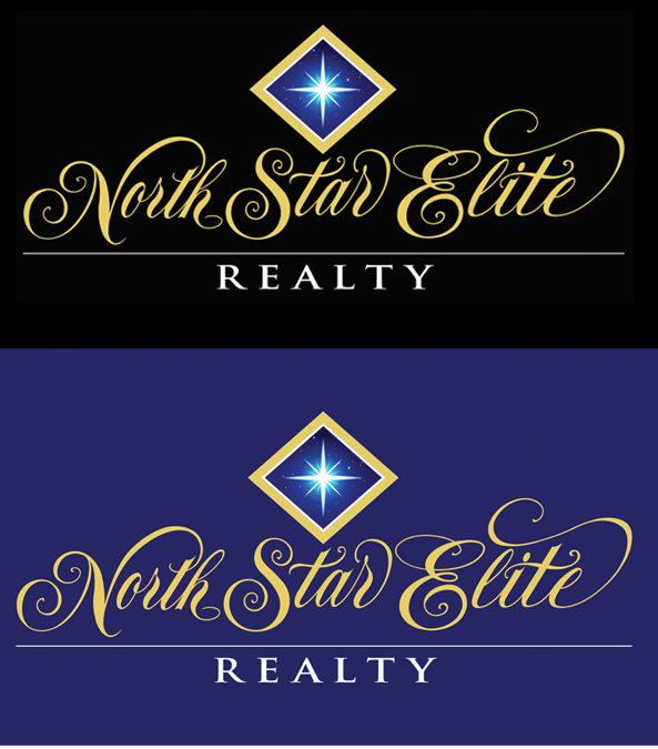
Ted was recently given the assignment of creating a new logo for an up and coming real estate company in North jersey who sells very high end properties. The company name is excellent…North Star Elite Reality. Ted solution was to create custom hand lettering using classic special script letterforms that project a very elegant, classy feel. Ted used his long-established skills to create very unique initial caps letters for the N, S and E that project great flair and style. In addition, Ted created a very striking gold diamond symbol with a dynamic image of a glowing north star. The diamond shape also adds elegance to a logo that the client wanted to project class and elegance. The centered placement of the diamond shape and north star over the lettering creates a very pleasing symmetrical design.
When Ted moved on to color studies he wanted a different and striking combination so he chose of gold lettering on a black background and midnight blue background which really adds drama and sophistication to this exclusive lettering that’s far from a font straight out of the computer. The clients winning selection is the black and gold version. So, if you are in need of design that exudes elegance, there is no better solution than the thick and thins of Spenserian script hand lettering. This is Ted 213th Career logo.
Recent Comments