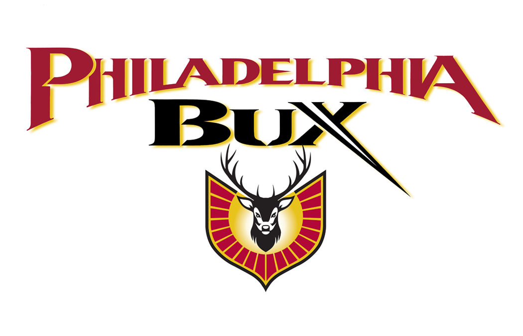
Secondly, Ted then came up with a strong male buck symbol and made the eyes very intense. To make the buck symbol really pop Ted designed a very unique emblem/shield shape and surrounded the buck with a circular burst of red liner liners. To enhance the type even further Ted added a white to gold racial gradient which draws the eye directly to the center point of the intense deer symbol. The finishing touch after many color studies was to add a gold drop shadow to the typography to make it look even more 3 dimensional and colorful. The final design resulted in a rave review from Ted’s client available with Googl if you type in Ted DeCagna Graphic Design – Reviews or check Reviews on this web site. So, who said Pharmaceutical logos have to be boring?
Let’s face it pharmaceutical logos and medical products logos can be quote boring and unimaginative. Ted DeCagna was recently given the challenge of designing a logo for a pharmaceutical sales team in Bucks county PA. The name of the sales team is “Philadelphia Bux”, and the client wanted something exciting with the typography and a symbol of a buck incorporated to motivate his sales team. Ted’s design gears immediately went into overdrive as this assignment offered the opportunity to work with one of the most exciting letters in the alphabet an “X”, in Teds opinion. “The inherent nature of the cross strokes on an X allowed Ted to design a totally unique X with a dramatic sharp point shooting to the lower right. This custom hand lettered logo design is enhanced with an inner white stroke that almost reads as a white spike within the X. Ted tapered the first letters of Philadelphia from large to medium to large which created a very dynamic symmetrical typographic effect. Ted chiseled some of the strokes to add an even more exciting edge to the dynamic lettering.


Recent Comments