
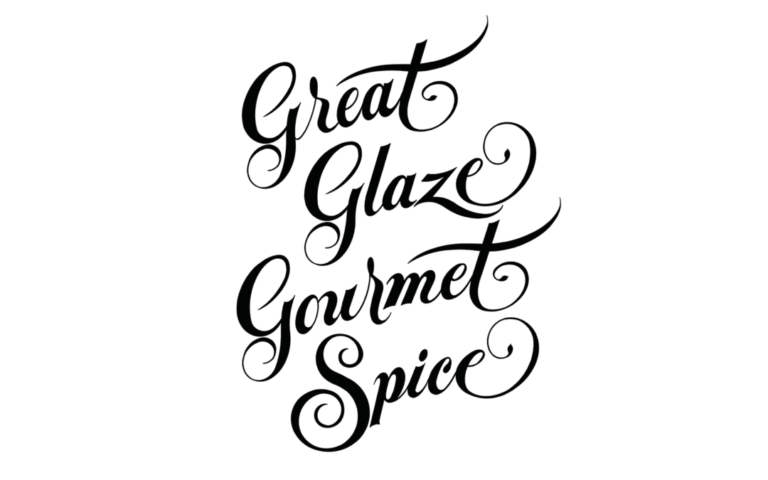
I recently had a label design challenge for a new gourmet spice product. The product logo challenge was for a new product named Great Glaze Gourmet Spice. What a super name! I never select a standard font without hand modifying it to make it something unique. There is nothing more predictable and boring for a logo than using a standard font straight out of the computer. Thanks to my classically trained hand lettering skills, this assignment screamed custom Spencerian script; one of my favorite and best areas of custom hand lettering. A good example of classic Spencerian script is the world-famous Coco Cola logo.
The client wanted a classic, home style quality to the label design, so I first tried two very unique fonts that I own and modified them with custom letters and flourishes. They looked very good and reduced well for the label, but I knew I could do better. Reducing any logo to a tiny size is a basic procedure designers use to insure legibility and judge how it will look and read small. This test is critical as many logos look great large on a sign or truck but if lettering gets too illustrative or busy, it can be very hard to read at a small size of a label or business card thus making it a bad design; this can be a major mistake.
I wanted something more unique with a creative flair, so I hand rendered this great product name in a bold Spencerian script style that would read well very small on the label. I created a beautiful “G” since it would be repeated 3 times in the logotype. The repetition of the exact same initial letter 3 times in the same logo is very rare and adds to the look. The other letters that gave me an opportunity to give them a flair were the T’s and E’s. I like to finish words with a curled flourish to give the letters elegance, while being careful not to over do it by making the already long name too busy. The best designs use the “Less is More” approach”, but that doesn’t mean it needs to be boring when a logo opportunity like this logo presents itself to have style and flair. In my effort to make the logotype even more unique, I chose to curve the baseline of each word giving the logotype an ever greater typographic flair.
One of the other best letter opportunities of this logo was the “S” in Spice as the “S” is in many professional opinions the most beautiful letter in the alphabet. So I borrowed an S style from my designer hero, mentor and instructor from New York’s Pratt Institute, Ray Barber. I was very fortunate to study under Ray Barber at Pratt Institute for four years. He was one of the foremost great New York master typographers of the 70’s, 80’s and 90s, who taught me to love typography; his spectacular and impeccable hand lettering works remain a great inspiration today!
The final approved hand lettered logotype, shown above after precision rendering and retouching was scanned and converted digitally, so it can be colored several different colors in the color study phase of design and then scaled down and finally applied to the actual full color label design (to come soon).
Ted DeCagna has created 198 career logos to date and has earned 24 national design awards. Most of Teds logo designs contain custom hand lettering. See 35 Logo Design Samples on this web site www.tdgraphicdesign.net
Recent Comments