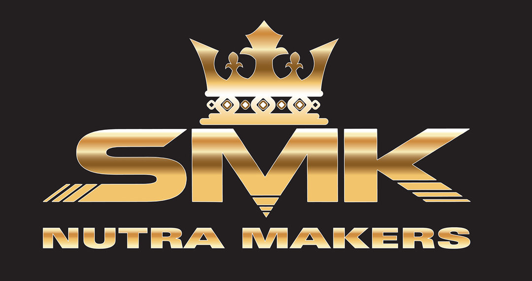
In his career Ted DeCagna has designed 199 custom logo designs to date. Ted has earned 33 design awards and 24 of those are for logo design. Ted was recently given the challenge of designing a logotype for for a food scientist company who makes custom, nutritional, power blend, shakes for professional sports trainers. The client, SMK Nutramakers requested the design of a dynamic, contemporary logotype using their letters with a crown symbol incorporated, symbolizing that they are leaders in their specialty. Ted credits his many award-winning designs to his love for typography, many years of training at Pratt Institute and special skills of hand lettering. “If the letterforms aren’t unique, they are usually boring and predictable.” “There’s nothing worse than a predictable design with lettering straight out of the computer that you have seen a dozen times before.”
Ted’s first step with any logo challenge was to design several different custom, hand lettered, modified fonts that had the energy and current feel the client was looking for. After exploring several different fonts that were appropriate, Ted decided to use a new contemporary looking san serif font at the core, and digitally extended the font (stretched the letters width), to give it a more stream lined look. He then added an exciting linier effect through some of the letters to make them more unique, but Ted is always very careful not to overdo it and hurt legibility. He feels reaching a creative design is number one and legibility is always an equal priority. “Some inexperienced designers create very creative logotypes but can bastardize letters to such an extent you can’t read the client or product name easily.” This is a critical mistake Ted is very careful to never make. “A great logotype is never hard to read.”
Finally, after achieving a vibrant custom logotype with the perfect crown symbol the client was looking for he then colored the design in several different color combinations but felt none of them looked very special. The client was very happy with the design but then asked Ted how can he make the logotype look even more dynamic, richer?
Ted’s solution was to create the special effect and make the letters look metallic. He added liner gradients of the perfect color to convert the logo from ordinary to special metallic gold lettering. This is largely a trial and error special effect of exploring different colors and different liner gradient thicknesses positioned in just the perfect spot to make the letters look reflective, the way actual gold mirror or polished brass letters reflect light. The end result is a 2-dimensional logo that has the striking pop of 3 dimensional letters. The gold color was the perfect color to use given the choice of the crown symbol and metallic letters against a black background create a dramatic effect that are sure to impress the client’s customers and prospective customers for many years to come for all marketing purposes: signage, web site, trade show banners, brochures, business cards. This is a good example that metallic letters are the ultimate special effect when an eye-catching, contemporary logo is needed.
Recent Comments